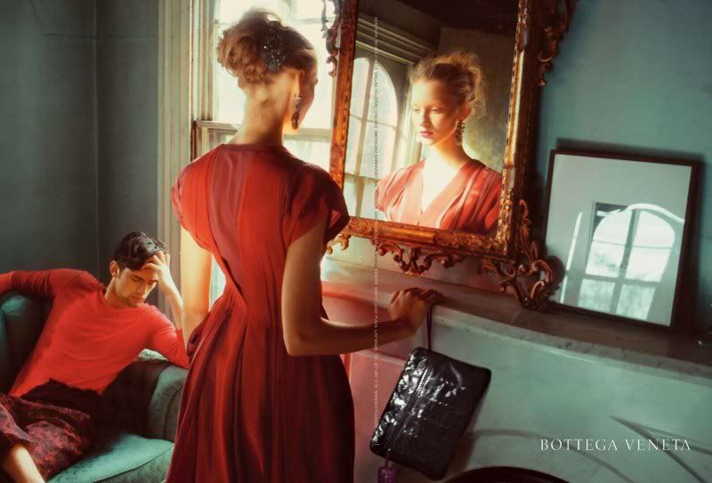
Both models seem to be deep in thought. For some reason I picture the pair scheming about something... What is your take on this?


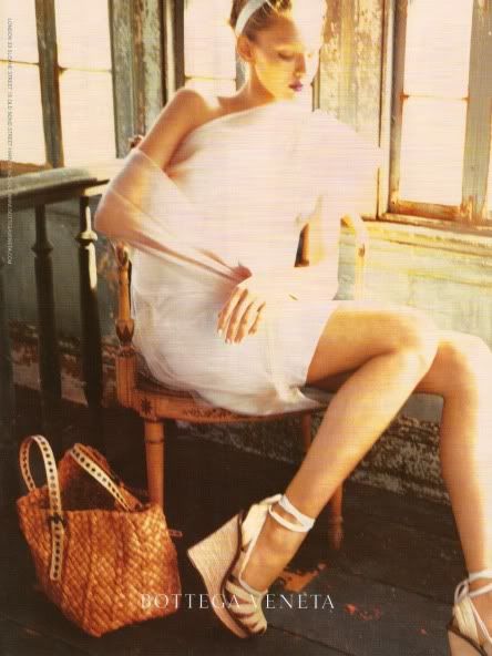
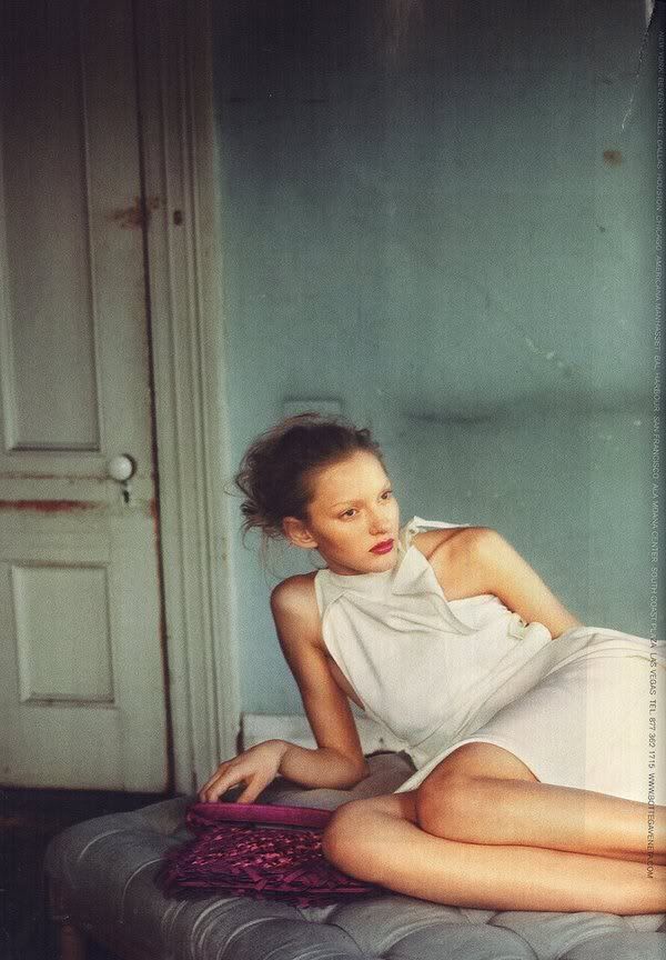
I like how these photos are somewhat blurry rather that crisp and defined. In my opinion it adds to the mystery of the photos, and makes them more visually interesting. The overall warmth, haziness and expressions on the model's faces work together to create a beautiful campaign with a very relaxed feel.

9 comments:
I don't know theres nothing in these images that capture my interest. Btw you should consider doing a post on Tim Walker, he's an amazing photographer.
I adore the Bottega wedges!
These are stunning, adore them!
tweet tweet tweet
x
lovew the pictures!
Very relaxed feel to these photos which is great for summer/spring accessories, but ultimately a little boring.
Beautiful i love the elegant clothes contrasting with the worn walls and doors- stunning.xx katie
would love you to call by
www.fashionclocked.blogspot.com
katie.xx
I just adore the second photograph. The colours are so soft and sensuous. I also recently saw the same image in the German Elle Magazine. xoxo
I agree with you about the photos. Really love how they make these campaigns so beautiful!
I love the feeling of these photos...xx
Post a Comment